Chip Kidd
 Chip Kidd is a designer and writer from New York, he mainly designs book covers for Alfred A. Knopf (which he has been doing since 1986) Which has helped to create a revolution in the art of American book packaging. He has won the National Design Award for communications and for the use of Photography in Design Award from the International centre of photography and many more.
Chip Kidd has also published two novels, ‘The Cheese Monkeys’ and ‘The Learners’ as well as ‘Batman: Death By Design’ (An original Graphic Novel published by DC Comics and illustrated by Dave Taylor. He is also the author of several books about comics.I really love the book covers he has created and the way they are laid out. One thing that made me look at his work straight away was the fact he has designed book covers and comics for DC Comics and other superheroes as I am a massive fan of them and then when I actually saw his other work I was really intrigued with the styles and illustrations he had done.
One of my favorite covers he has done is the ‘Great Neck’ I just love the way he has incorporated both photography and computer graphic into the design and although it looks really good it is in fact so simple.
I also love the way all his covers are so unique but fit so well with the subject of the book its for. As well as this I like how he uses a range of medium instead of just one, such as photography, Computer Graphics, Paint, Drawings ect.
Chip Kidd is defiantly one of my biggest influences for book covers in Graphic Design and is also my favorite I love his work and will definitely use it for reference when designing a book cover.
Kate Moross
 Kate Moross is a London-based illustrator that is best known for her work with 3 sided shapes, typography and music. She has worked with Cadburys, Topshop and Samsung as well as many other well known Brands.
I really love how quirky and bubbly her work is and how is captures her personality perfectly.
Her work is always so bright and colorful and although she only really uses basic shapes when used with the color and all put together her work becomes and looks more complex.
Her work is so wonderful and I find it really inspiring and influential. I love all the unusual features about it and how clever she is with pattern making, like the Disney picture she has done. At first it looks like just random shapes behind her but the more you look at it the more you see the shapes actually make up the most well known Disney characters.
I also really like the flow within her work and how everything works so perfectly together instead of just looking like a mess of shapes and words.
I am totally in love with her work and everything about it just the whole idea and themes she uses and just how it conveys her personality and the way she puts it all together. I would love to be able to create work like her and she is definitely one of my most influential graphic designers.
Miles Donovan
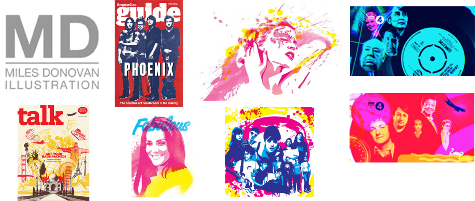 Miles Donovan is an illustrator and a member of Peepshow Collective. His work has been used internationally for editorial and advertising clients including the New York Times, Creative Review, Newsweek, The Guardian, The Telegraph, TIME, Wired and Qantas. Whilst working with Peepshow Miles Donovan has worked on Design, Art Direction and Animation Projects for BBC, Nike, Channel Four, Philips, Toyota, Diesel and even more. I find Miles Donovan’s work really intricate and interesting, I really like how he uses layers in his work and the range of colours he uses. I think his work always looks professional and although they are collages they are very clean cut and smooth flowing.One of my favourite pieces of his work is the Madonna one. I think that it looks very beautiful and captivates her well, I like how he has kept strict to a theme and the paint splatter effect he has added with it and managed to make the tones in the image block but flowing and kind of like a water painting.I find the way he presents his work influential and marvellous and would consider this type of presentation in my work to I an definitely going to take his work on board and try out some work in his style.
Kate Miller

Kate Miller Studied Illustration and Animation at Manchester Metropolitan University, Graduating in 1993, she then went on to do a masters in Illustration at Kingston University. At Kingston she focused on Screen Printing and went on to have numerous exhibitions and be represented by galleries from London to Cornwall.In the last 10 years she has focussed entirely on illustration, taking her art away from the printing press and on to the computer. Despite becoming digital the process has remained the same, a layering of sketches, mark making, textures, photographs and found images all arranged and composed with a good splash of colour.I love Kate Millers use of mixed mediums and find that they work really well together, I think the way she has the photographs over the background and then adds her own illustrations over the top looks really good and gives it a real edge. I also like how even though her drawing aren’t brilliant they work really well with the rest of the image and give a softer and fun feel to it.I would like to create a piece of art in the style of Kate Miller as I find her work admirable, especially towards poster and promotional material.
Herb Lubalin
 Herb Lubalin was Born in 1918 in America. Before he Graduated in 1939, he won second prize in a poster competition. It was this event that proved to be the impetus for his career.In 1964 he started his own business designing posters, Magazines, Packaging, and Identity Solutions.His work attracted many awards, His first was in 1952, a New York Art Directors Club Gold Medal. He was also a sought-after lecturer, undertaking worldwide tours. As well as holding the post of visiting professor at his old school, The Cooper Union, he also taught as Cornell and Syracuse universities. He later died in 1981.One of the main things I like about Herb Lubalin is how clever and quirky his work is and the way he represents the word by the way he lays out his typography and the illustrations he adds, my favourite pieces of work he has done has to be ‘Beards’ and ‘Mother and Child’. I really like the way ‘Mother and Child’ is presented and find it really clever the way he has put the ‘&’ in the ‘O’ to make it look like a mother carrying her Child. His work fits perfectly with the word/sentence/subject its for and describes it exactly.
I find him to be my biggest influence towards typography and logos and think his work is inspiring.
No comments:
Post a Comment